 extending the brand
click image to enlarge »
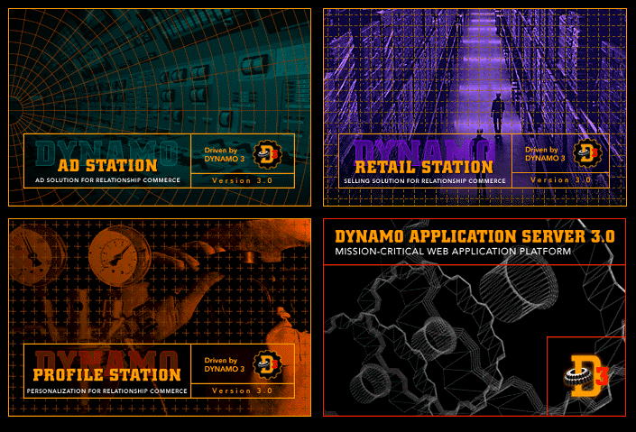
Expanding the product line demanded a major brand extension. We adopted a web-appropriate metaphor-- weird science. Saturated duotones, individual color palettes and grid reflect each Station's functionality while creating unique personalities. The minimal design for the development environment clearly differentiates it and helps reinforce brand structure.
|

|